Each primary color is accompanied by 2-6 shades that allow for versatility in application. These are to be used in situations when added contrast is needed
Download assets packOur goal by creating our design system is intended to manage design at scale using reusable components and patterns


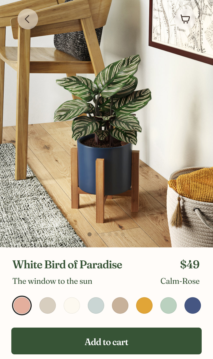
The primary buttons should be the strong visual indicator to help the users complete their journey. Primary buttons should be used in situations where the user may want to go ‘next’, ‘complete’, ‘start’, etc
The website should tell users about product, as well as providing an easy way for customers to purchase